Why logos?
I've had the a-mamal name for a while, but until now I hadn't really given it a visual identity of its own.
Both a-mamal.com and a-mamal.dev are growing into their own spaces, and I wanted something that could connect them visually while still leaving room for each site to have its own personality.
I didn't want to start by designing an entire brand system. I just wanted to see if I could turn some of the ideas behind a-mamal into a simple mark.
The ideas
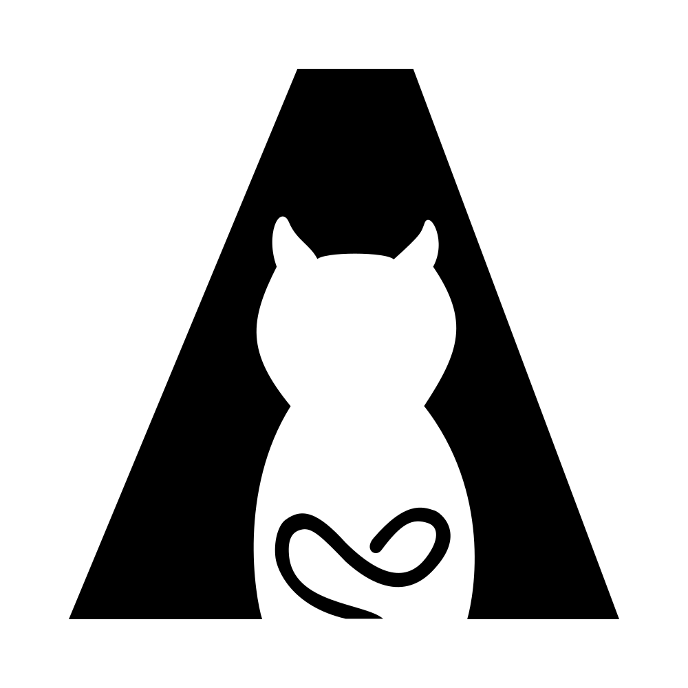
The most obvious starting point was the letter A. I wanted the A to remain recognisable as an A, but I also wanted there to be something hidden inside it. The idea of using negative space to create a cat seemed like a good fit.
The cat isn't meant to be a separate illustration sitting next to the letter. The goal was for the two things to become one mark; an A that also happens to contain a cat.
I also wanted to use the cat's tail as part of the A itself. Rather than simply adding a tail to the cat, I experimented with making it extend across the letter and become its horizontal stroke.
For a-mamal.dev, I wanted to take the cat idea in a slightly different direction. I wanted the cat to be more expressive, and the tail became an opportunity to reflect the different character of the site. Since a-mamal.dev is more about continuous learning, raw ideas and experimentation, an infinite loop felt like a natural direction for the tail.
Building the first version
I've had the ideas for some time, roughly sketched them, and tried different apps on my tablet so I could use a stylus. Some of them seemed way too complicated for just a first version, while others required payment to export as an SVG.
I made the first version in Figma using text, vector shapes and the Pen tool. This was less about getting everything mathematically perfect and more about seeing whether the idea could actually work.
There were a few things I had to figure out along the way, since it was my first time using Figma: how to combine and subtract vector shapes and how to make the cat readable without making the A disappear.
The ears, in particular, didn't quite come out as neatly as I had imagined. I considered refining them, but eventually decided to leave some of that imperfection in the first version. The same goes for the tail. I wanted it to feel like part of the A, rather than something that had simply been attached to it.
One identity, two sites
The two logos started from the same basic idea, but I didn't want to force them to be identical.
Both sites are part of the same a-mamal identity, but they have different purposes. A-mamal.com is the more polished and professional side, while a-mamal.dev is where I experiment, document things and allow myself to try ideas that aren't necessarily finished.
I want the visual identity to work the same way: shared ideas and recognisable elements, but enough flexibility for each site to develop its own character.
Why I'm calling them V1
These aren't the final a-mamal logos.
I could keep adjusting points, curves, proportions, spacing and other small details indefinitely. At some point, though, I need to stop designing and actually look at the logos in context. That's one of the reasons I'm calling this Version 1. It's a working first attempt, not a finished answer.
I wanted to use them on the actual websites and see what happens when they have to work at different sizes, in a header, as an icon, and alongside the rest of the site's design. If something doesn't work, that's useful information for the next version. After all, my main goal is to grow the websites, not to be a designer.
What's next?
For now, I'm going to use the first versions and see how they behave in the real websites.
Eventually, I'll probably make changes. Maybe the cat will become simpler, maybe the proportions of the A will change, maybe the tail will evolve, or maybe I'll discover that something I thought was important doesn't work at all once the logos are actually being used.
That's the point of starting with V1. I don't need to know what the final versions look like yet. I just need to make the first versions real enough to learn from.